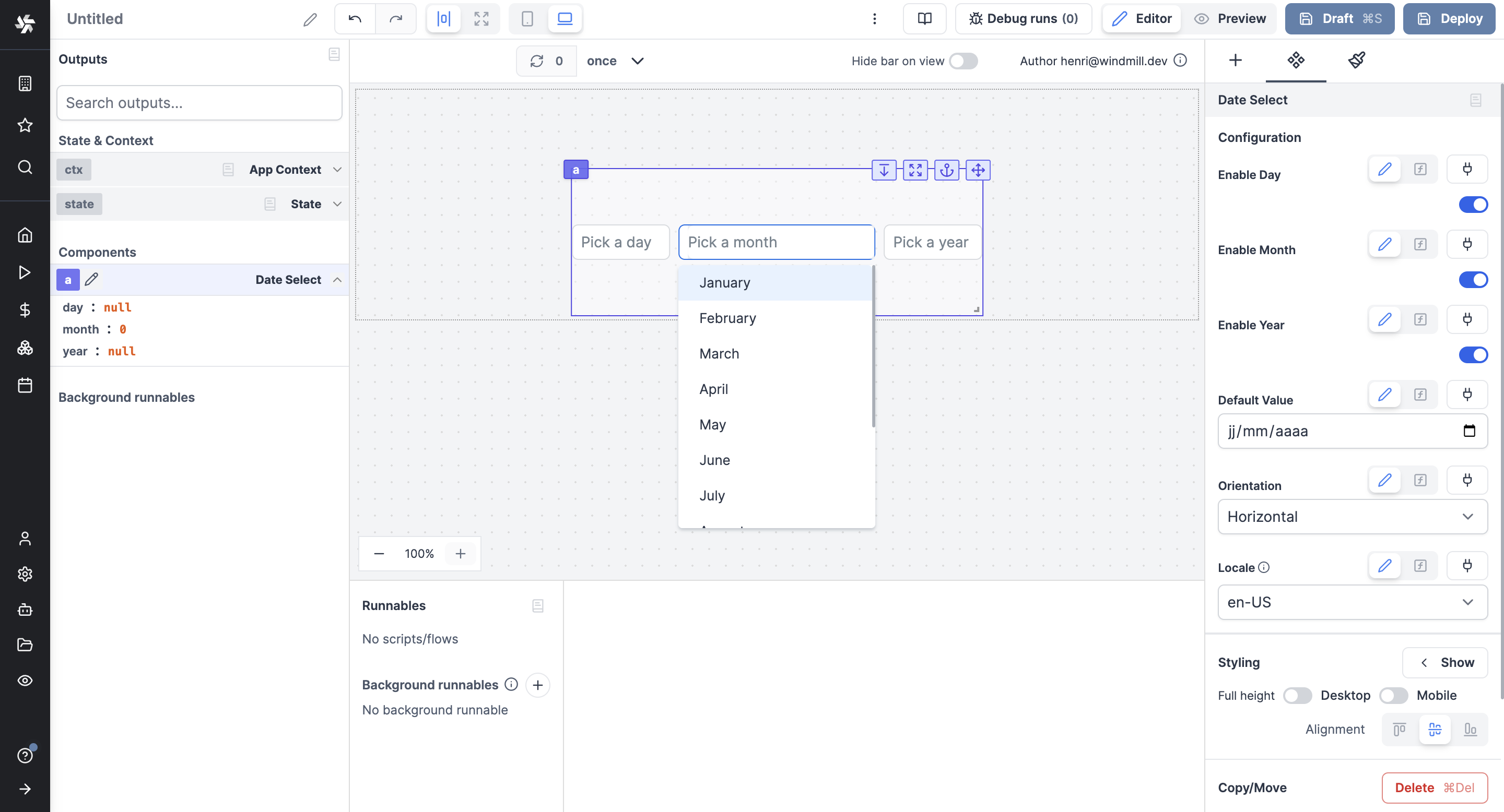
Date Select
The Date Select component allows the user to fill in a date by picking a day, month and year.

The following section details Date Select component's specific settings. For more details on the App editor, check the dedicated documentation or the App editor Quickstart:
App editor Documentation
The app editor is a low-code builder to create custom User Interfaces with a mix of drag-and-drop and code.
Apps quickstart
Learn how to build your first app in a matter of minutes.
Controls
This component can be controlled by frontend scripts using these functions:
setValue
The setValue function is meant to set or force the value of a component. This can be convenient in cases where connection is not the easiest pattern. Note that it's a bad idea to mix dynamic default value and setValue together.
setValue(id: string, value: any)
Date Select configuration
| Name | Type | Connectable | Templatable | Default | Description |
|---|---|---|---|---|---|
| Enable Day | boolean | true | false | true | Whether the user can pick a day. |
| Enable Month | boolean | true | false | true | Whether the user can pick a month. |
| Enable Year | boolean | true | false | true | Whether the user can pick a year. |
| Default Value | string | true | false | empty | The default value of the Date select component. |
| Orientation | select | true | false | Horizontal | Orientation of list of items ("Horizontal" or "Vertical"). |
| Locale | string: en-US, en-GB, en-IE, de-DE, fr-FR, br-FR, ja-JP, pt-TL, fr-CA, en-CA | false | false | en-US | The format of the date. |
Outputs
| Name | Type | Description |
|---|---|---|
| day | int | The Day value. |
| month | int | The Month value. |
| year | int | The Year value. |